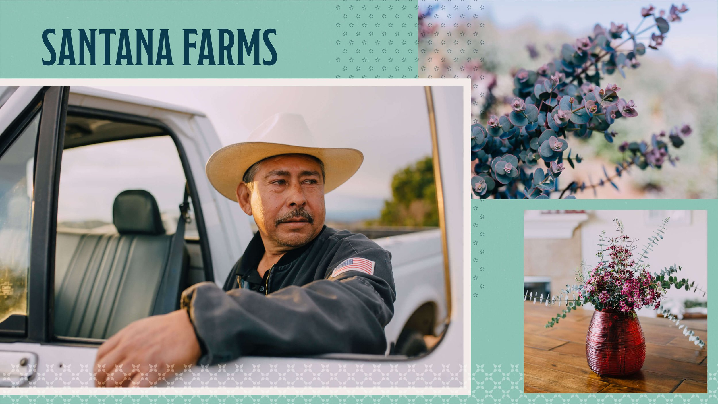
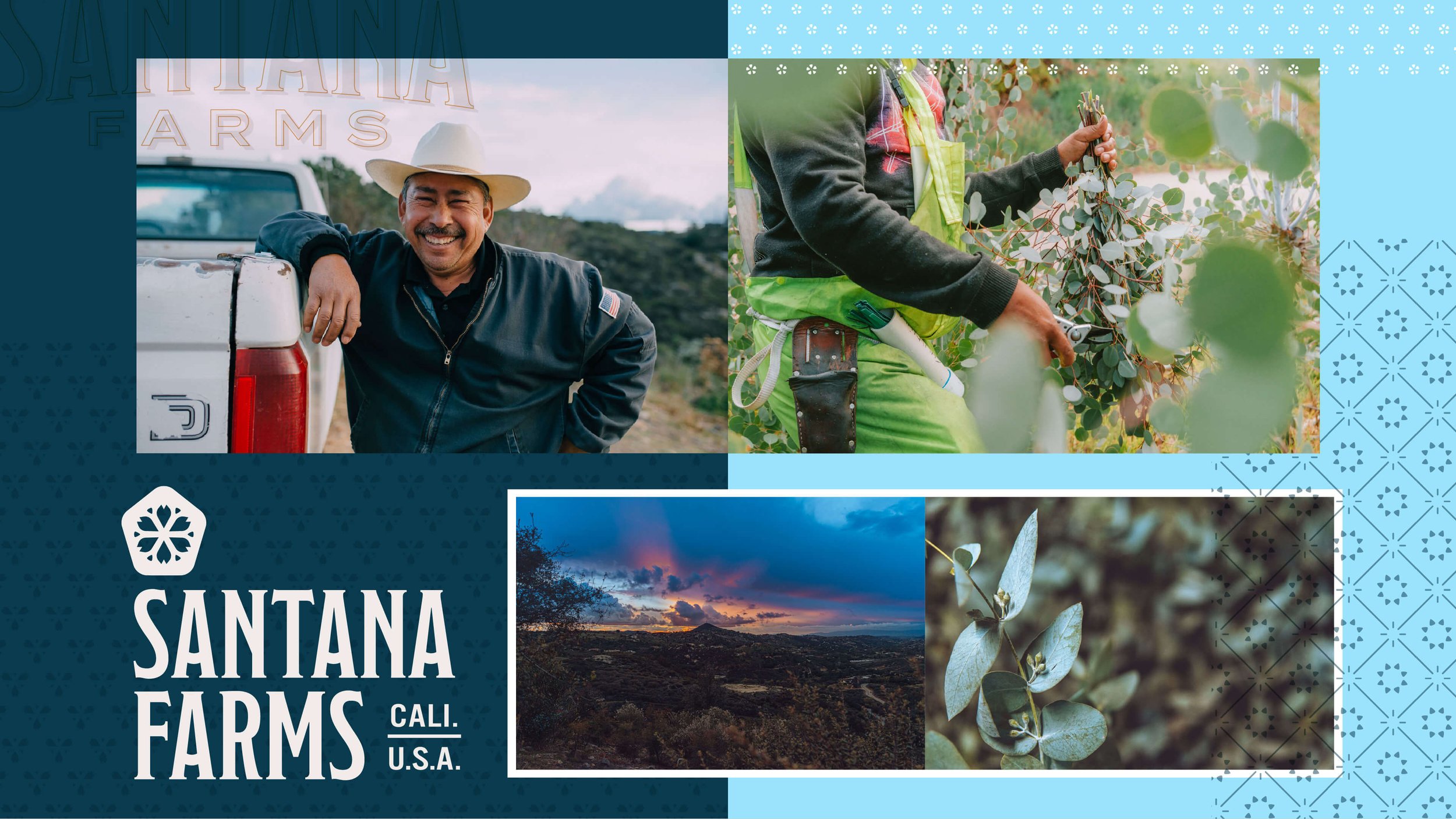
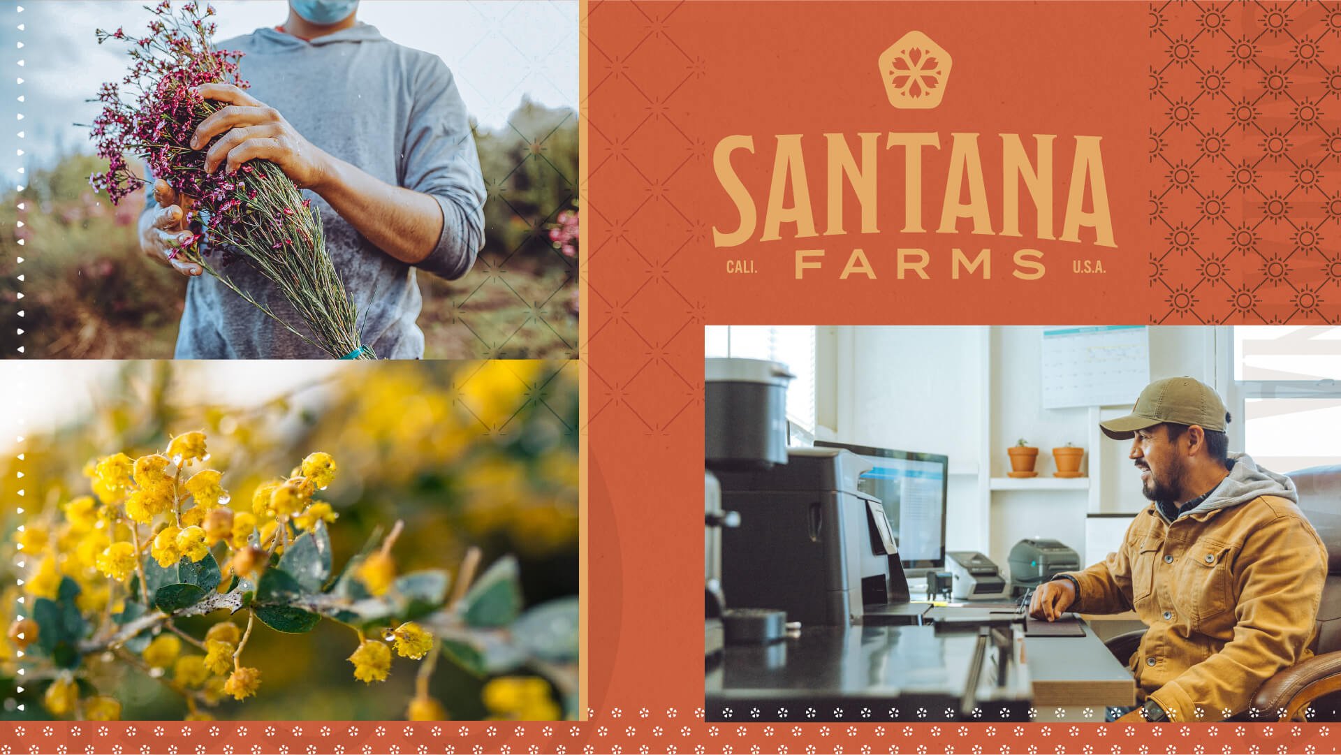
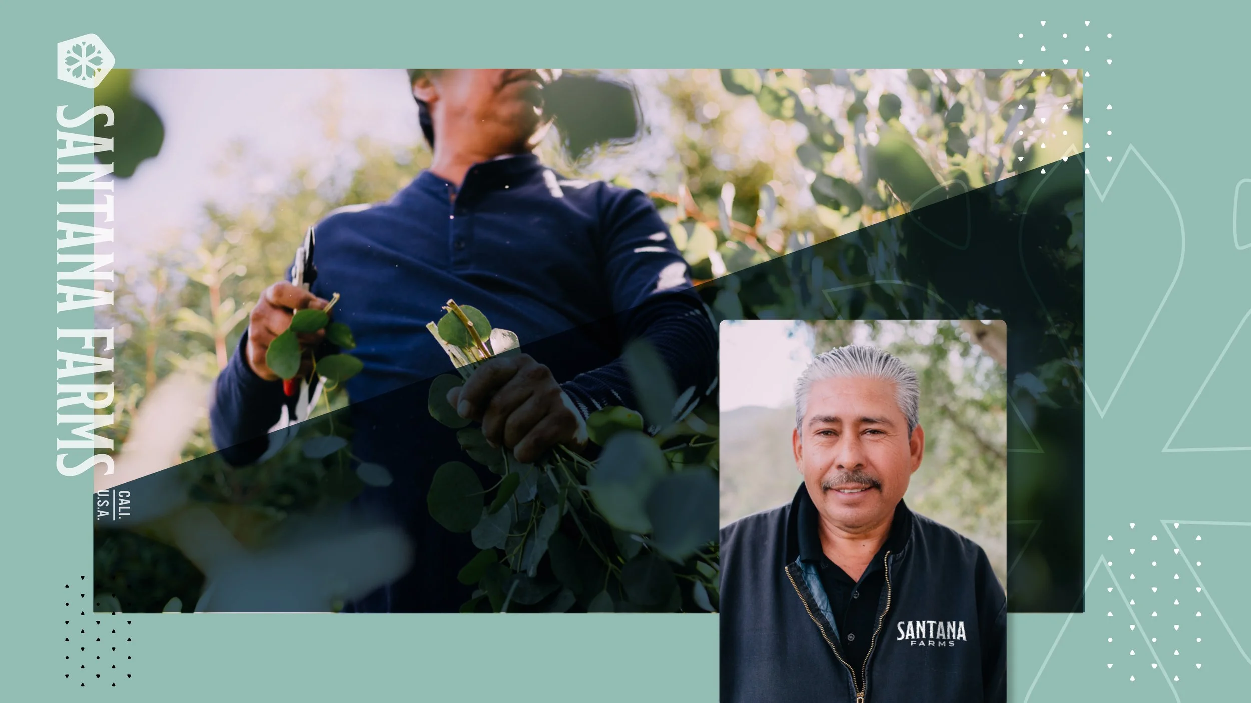
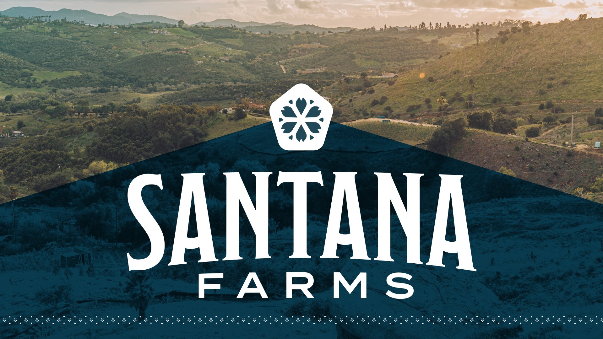
Cart 0
 

Santana Farms


The Challenge:

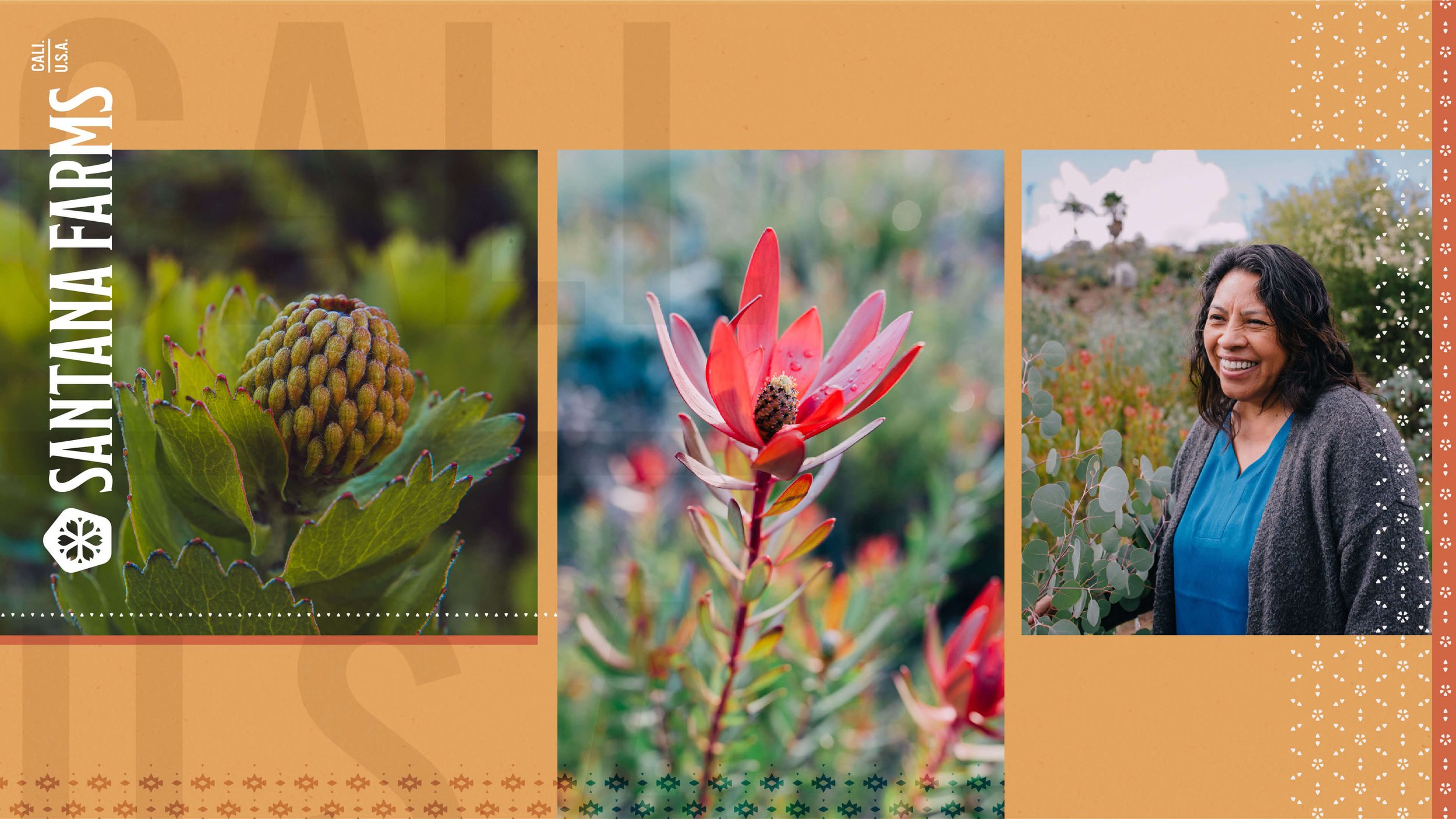
Over two decades had been spent nurturing a family owned farm planted in Southern California. Their specialty was and remains growing eucalyptus and floral greens. The initial ask was to build a website to bring the business into the digital age, online platforms and eventually e-commerce. The company started as Green Valley Flower Wholesale (GVFW), a name pulled on from the Green Valley region. This more common name was shared and commonly confused with a competitor.

The Solution:

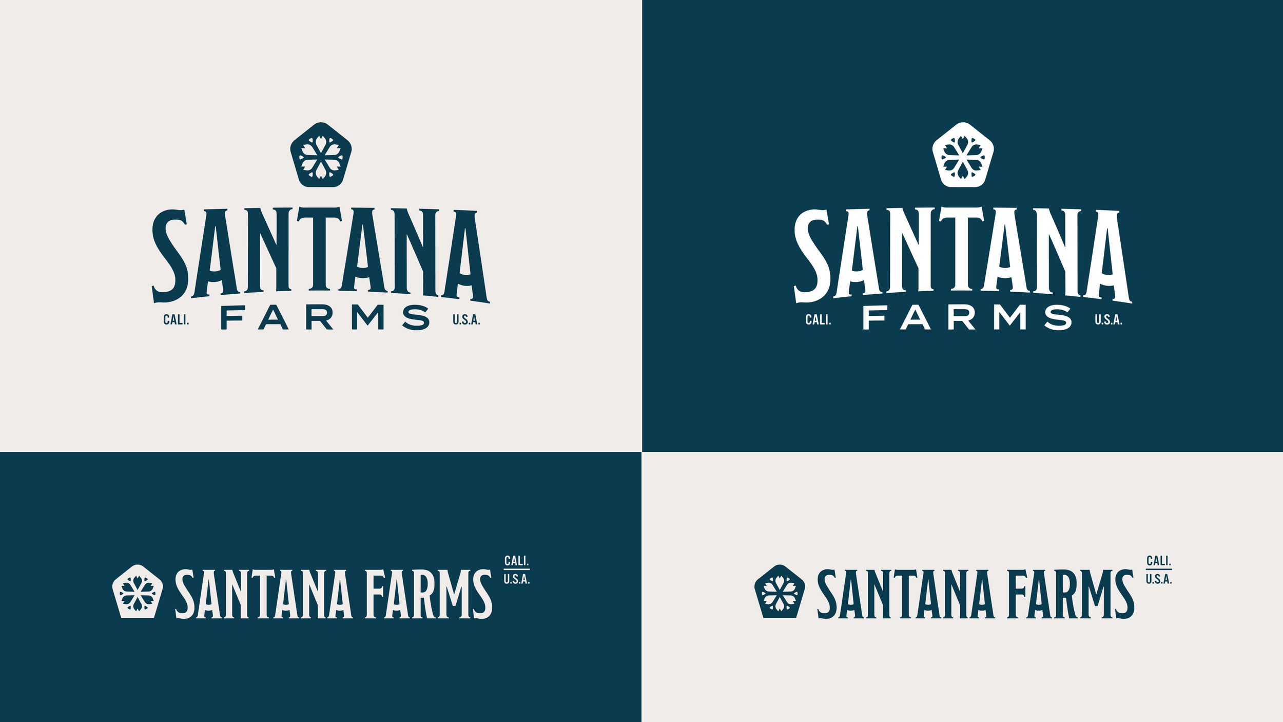
After meeting with them and working through some strategic questions, everyone was in agreement they needed much more than a website. What started as a website RFQ lead to naming, business strategy, rebranding, packaging, print collateral, and web design and development.


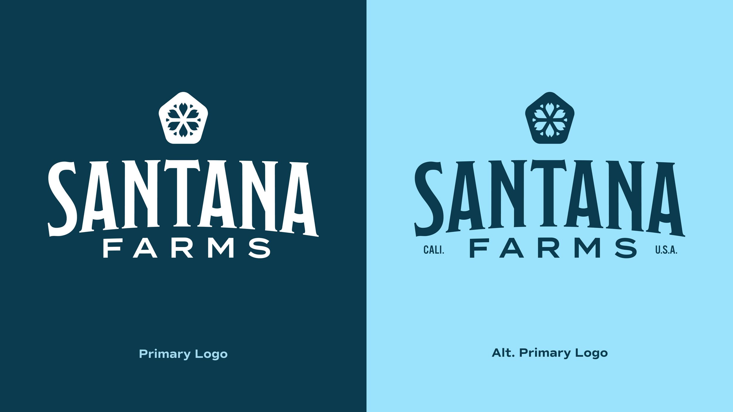
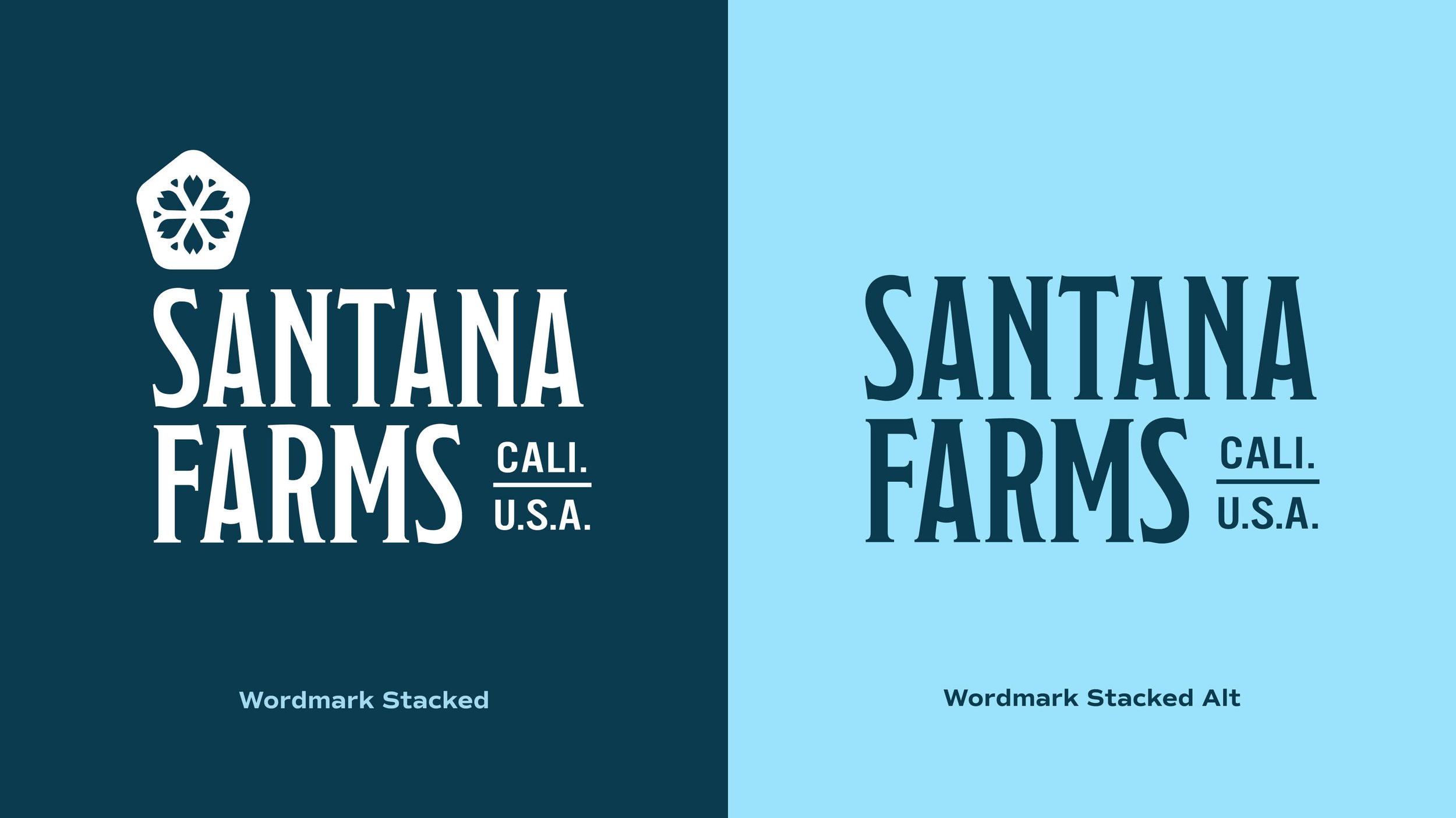
A season of growth: before and after

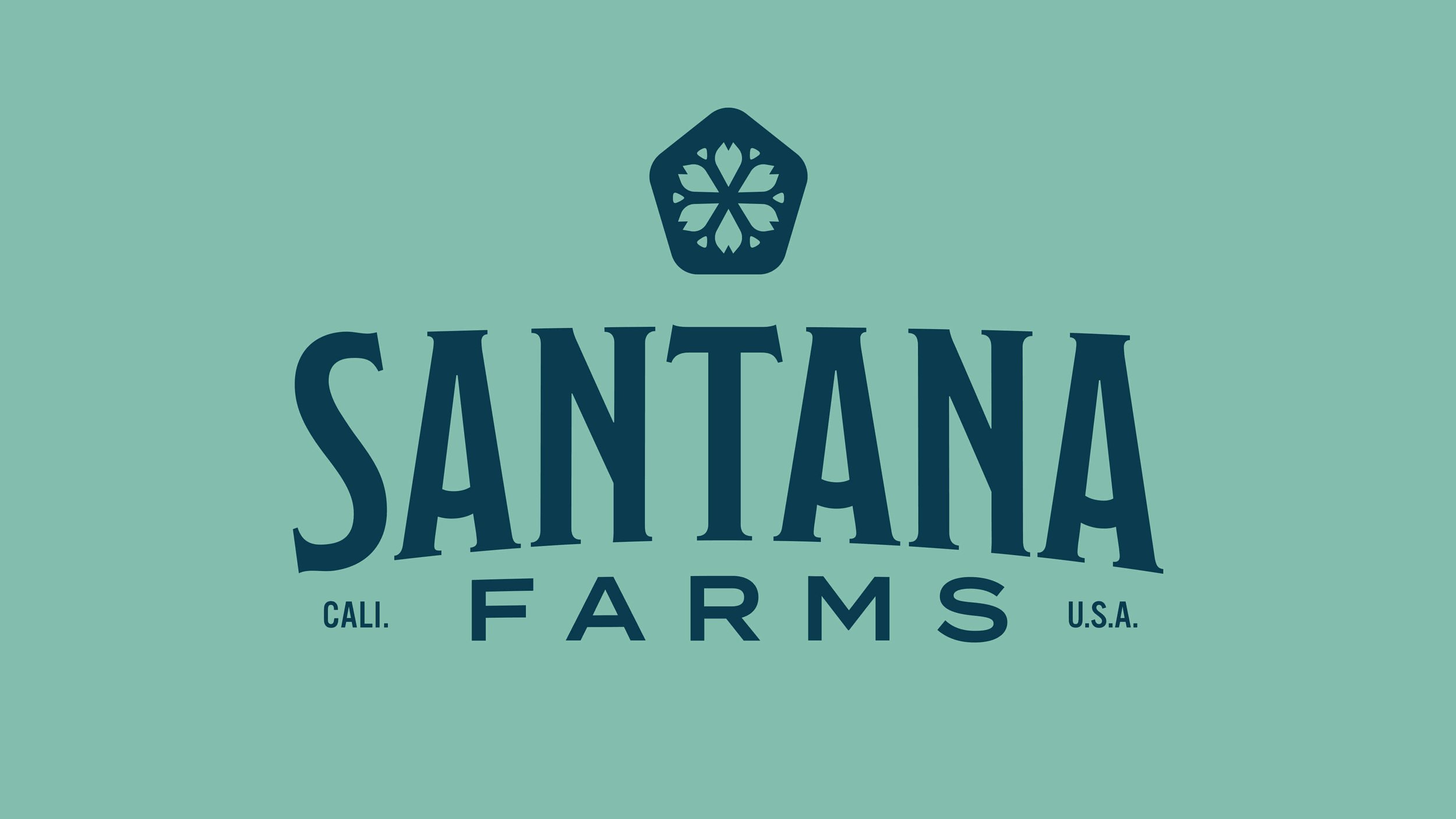
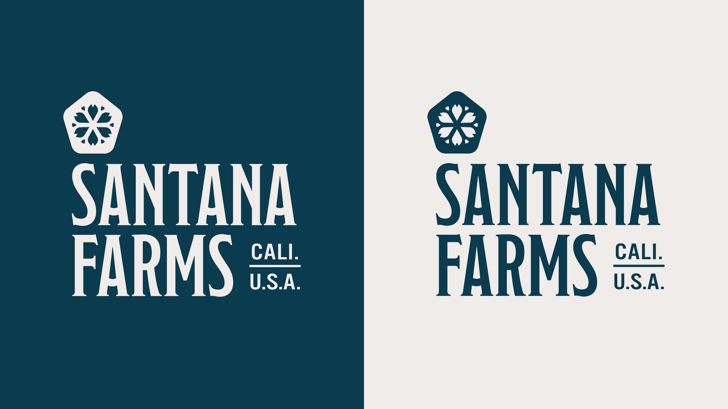
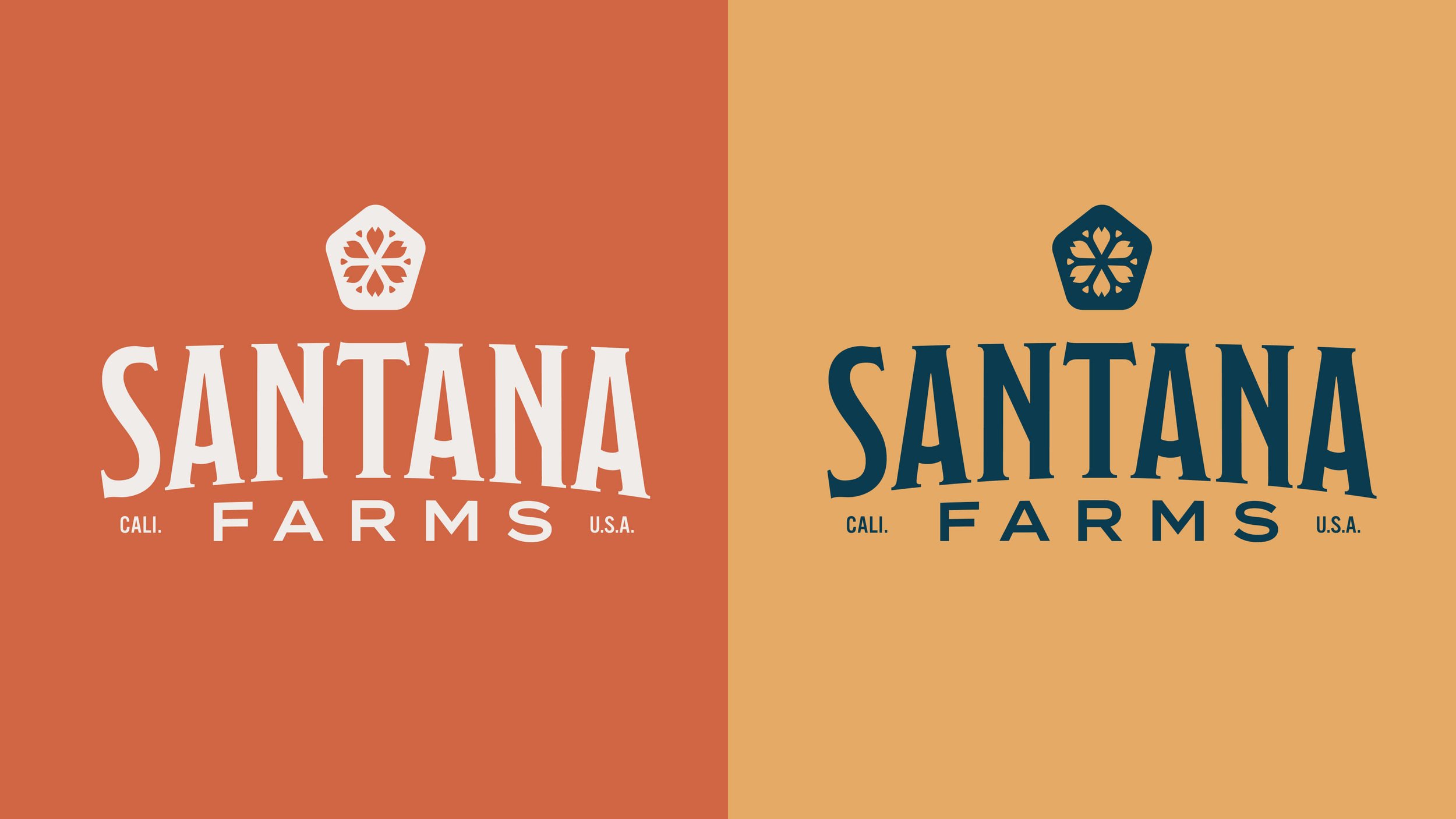
The CEO and owner, Manuel, knew things had to change to continue to grow. Armed with the knowledge that pruning leads to A fruitful harvest, they made the decision to cut ties with their company name and pay homage to Manuel’s mother, Santana. The transformation from GVFW to Santana Farms had begun.


Development

Doc-Reed-Brand-Designer-NC-Charlotte-Santana-Farms-Logo-Concept.jpg
 

Wordmarks, Icons,
and Lockups

During our time on site with the family, we discovered numerous touch points that resonated deeply. The natural elements of flowers, eucalyptus, and seed pods emerged as powerful symbols. In one memorable instance, Manuel stepped away during a break in the discovery session. He returned with a large plastic bin, barely fitting it through the door. With great care, he placed it on the floor with great care and retrieved a single seed pod—a treasure among hundreds in the container.

This simple moment sparked the vision for capturing the essence of Santana Farms—a focus on the roots of the family, the humble beginnings, and the elements that shaped their 20-year growth as a company. We aimed to honor these elements and captivate the journey from farm to table.


The type treatment was designed to reflect the stunning hills on the farm and in North County, California.

We focused on creating a responsive system to maximize the flexibility of this mark. One that would expand with them as the company continues to grow. With most logos, they go through rounds of refinement to achieve the final result.
It’s never as simple as Item + Item + Item = Logo


Patterns


With the number of flowers and greenery grown locally on Santana Farms, we wanted to build a system of patterns that would act as both accents and backdrops for images, marketing, and social use. These patterns were inspired by the greenery around the farm, their roots in Mexico, and their home in southern California.


 Application

Doc-Reed-Brand-Designer-NC-Charlotte-Santana-Farms-Pattern and Apperal-Frame 15.jpg


Consulting, Brand Identity, Strategy, and Web development.
We set up brand standards and created collateral options,
while developing messaging and verbal identity.

Visit the site.

Our work included:


Doc Reed: Project Lead - Creative Direction
Tyler LaCross: On-Site Stills and Videography
Gabriel Barletta: Product Stills
Sean Fox: Lead Designer
Ross Hagan: Story and Messaging
Patrick Hill: Lead Developer

Project
Credits:

Doc-Reed-Brand-Designer-NC-Charlotte-Santana-Farms-TML-SANTANA-0324-LORES.jpg